Luxury identityAtmosphere as brand language
Corporate identity · Visual systems · Digital presence
Presence is built before attention is earned
Maison Percept builds the visual systems behind sharper brands — across social, web, decks, apparel and every surface where perception is formed
Visual IdentityA sharper language for how the brand is seen, felt and remembered
Digital PresenceSocial, web and presentation assets designed to feel unmistakably connected
Brand SystemsA visual structure that keeps every touchpoint aligned
Digital presenceProfile systems with intent
Corporate communicationSharper presentation systems
Before / After
The first impression should carry the weight of the business
When the visual presence feels scattered, trust weakens before the conversation starts. We refine the system so the brand feels clearer, sharper and more valuable at first glance
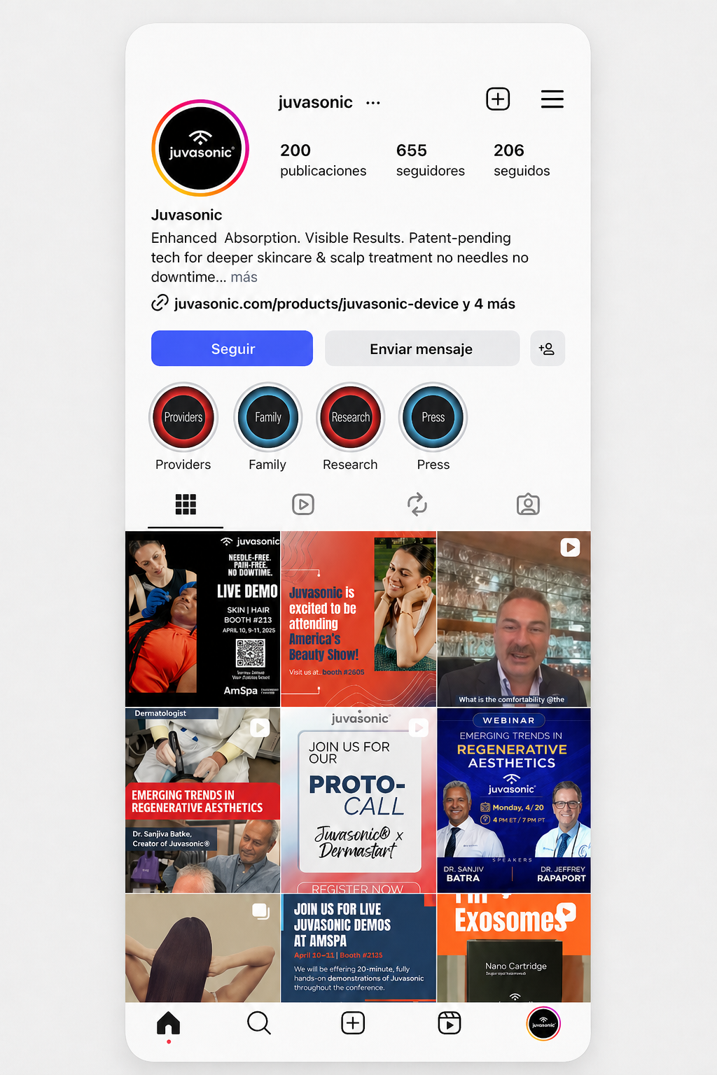
JuvasonicProfile preview
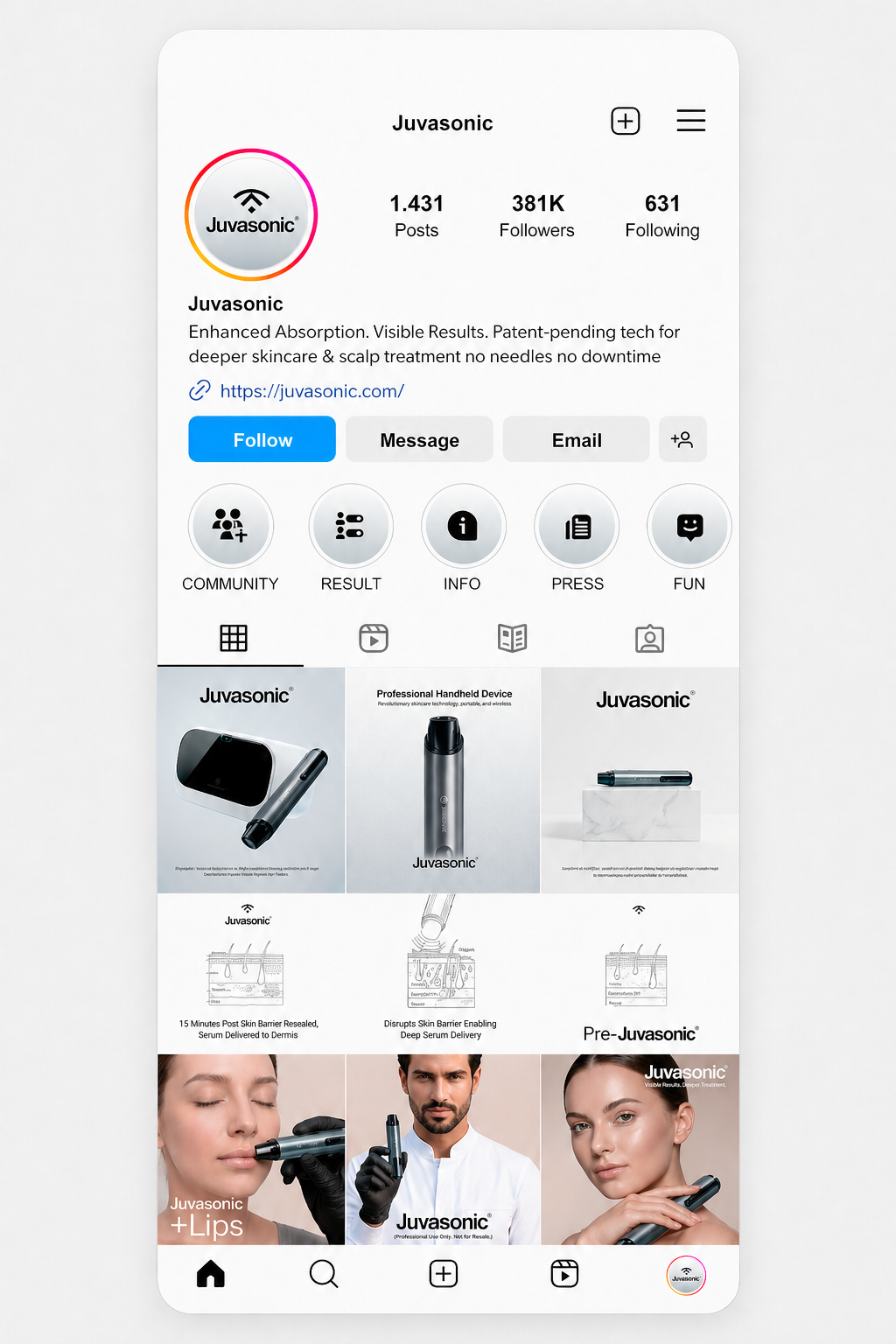
JuvasonicProfile preview
A presence with potential, but without a clear visual system
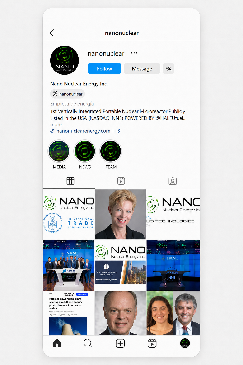
NANO NuclearProfile preview
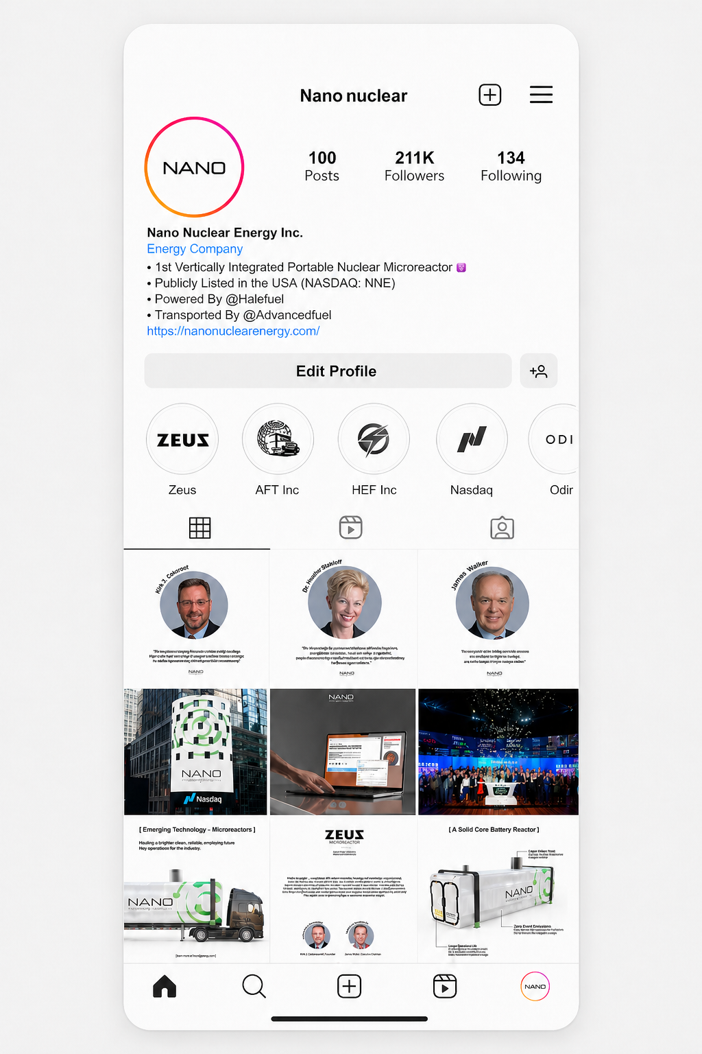
NANO NuclearProfile preview
A presence with potential, but without a clear visual system
Selected Work
Different markets. Same standard: visual authority
Each brand required a different language. The objective stayed the same — to make the business feel more structured, more credible and harder to dismiss
Case Study 01
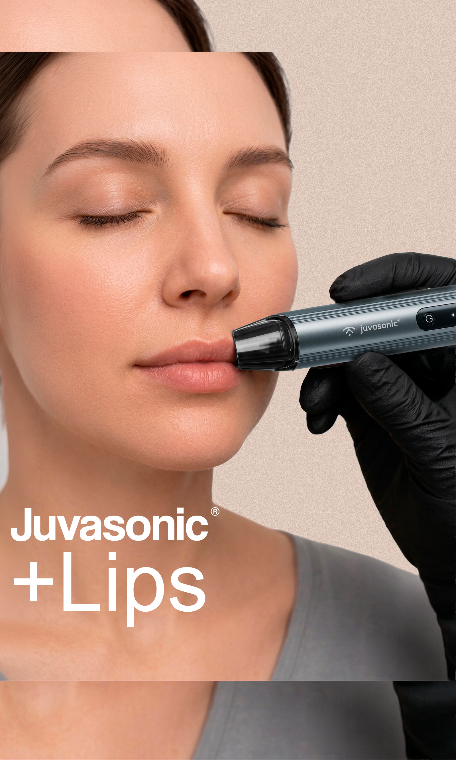
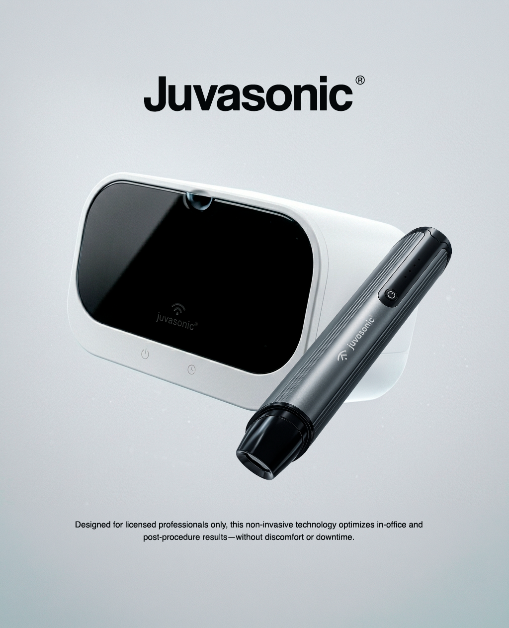
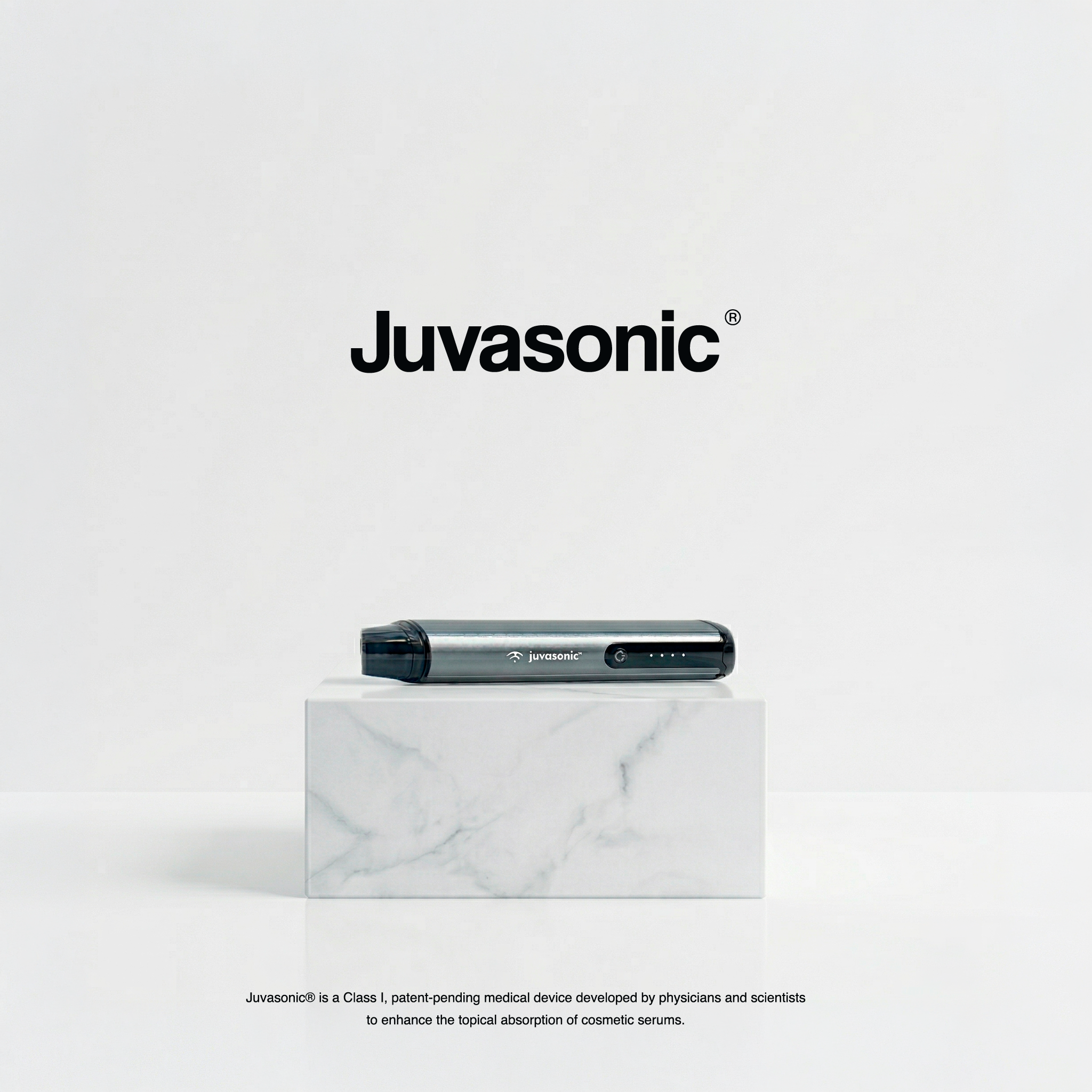
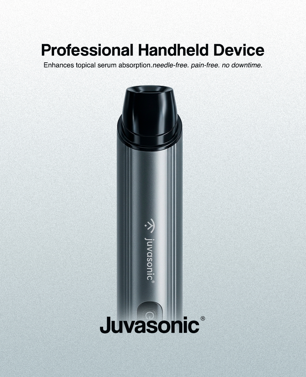
Juvasonic
A more polished visual system for a medical device brand — built around product clarity, treatment education and real-use context
Juvasonic needed a presence that felt as refined as the product it sells. We built a cleaner system around device education, treatment context, product imagery and social consistency
DeliverablesVisual identity refinement · Social media system · Product presentation · Website-ready assets
Strategic FocusMaking the brand feel premium, trusted and immediately clear
- Turn the profile into a stronger first impression
- Use treatment context to make the technology easier to understand
- Make product communication feel precise and premium
- Present the product, procedures and use cases with more clarity

Final social systemA cleaner feed structure built for trust and recognition
1 / 1
Case Study 02
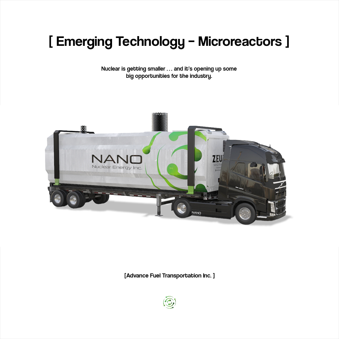
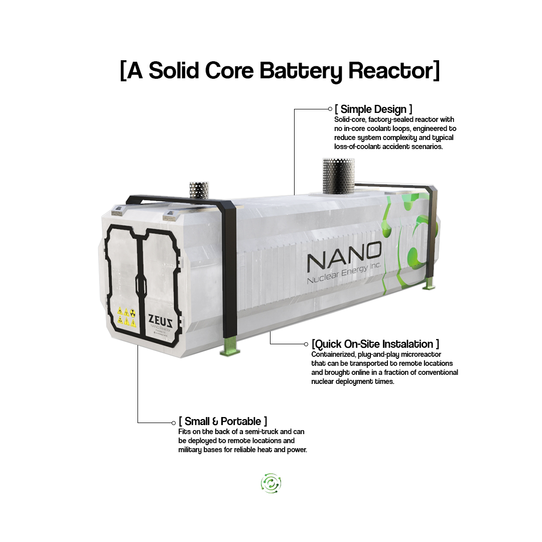
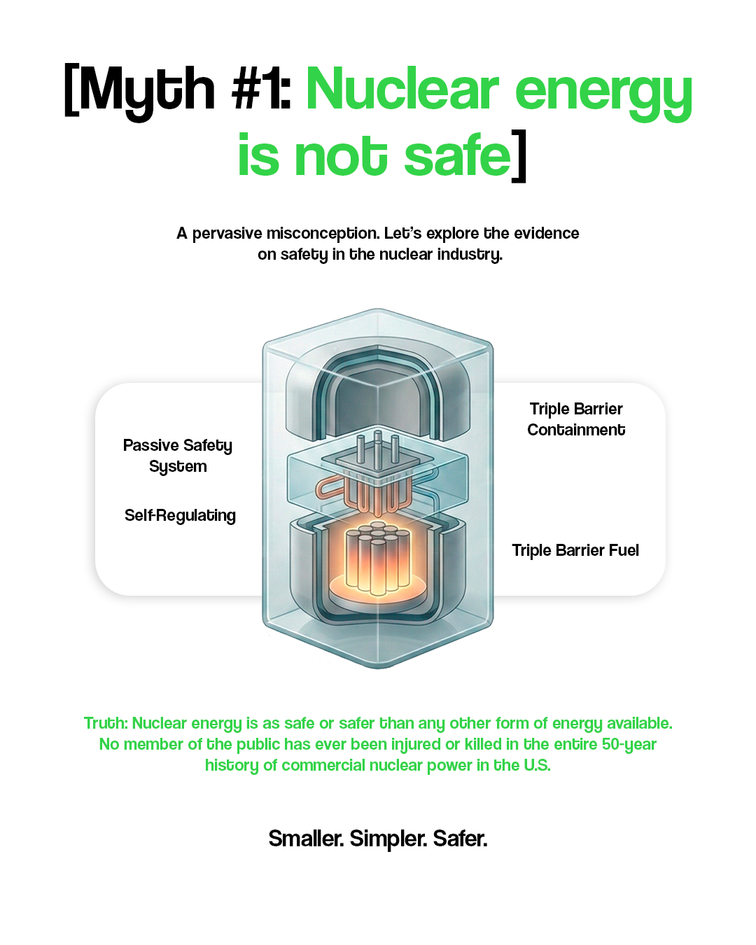
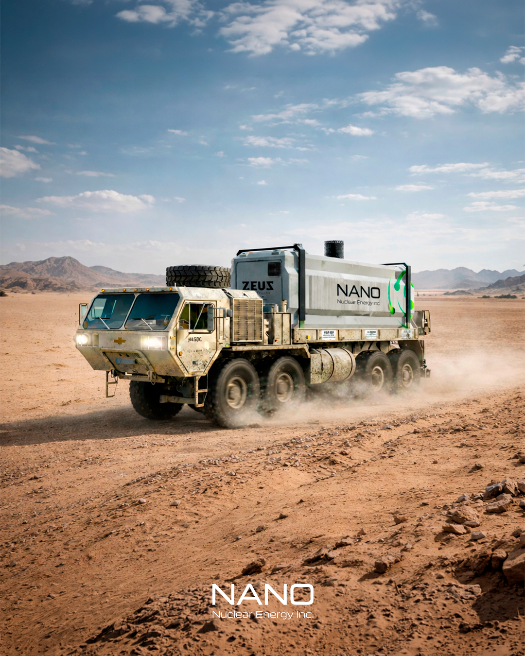
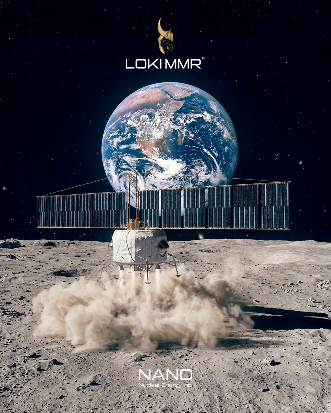
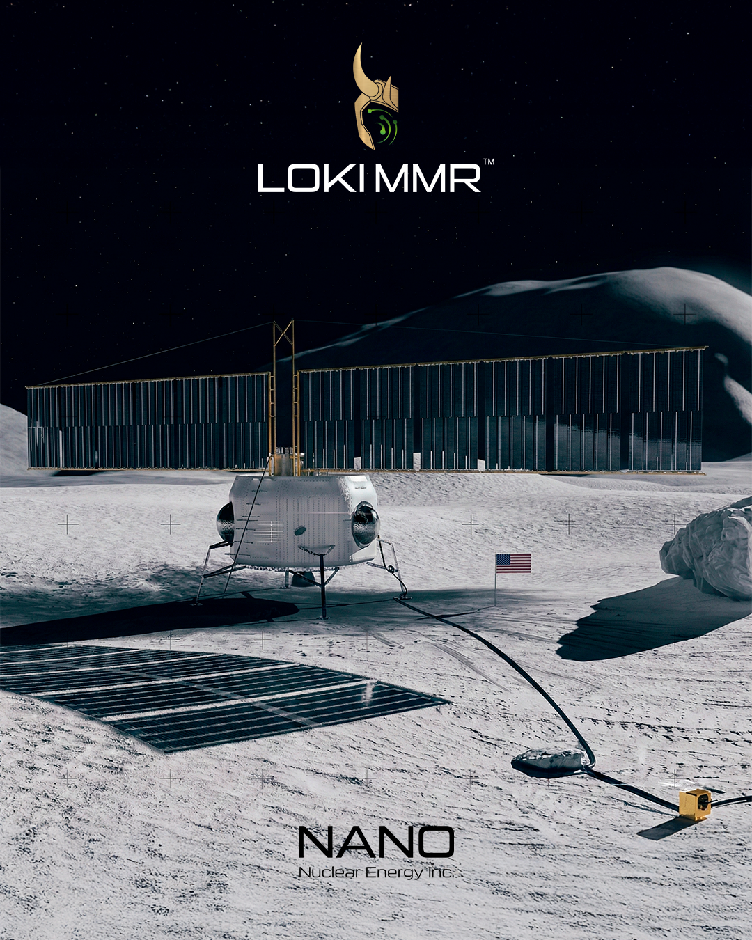
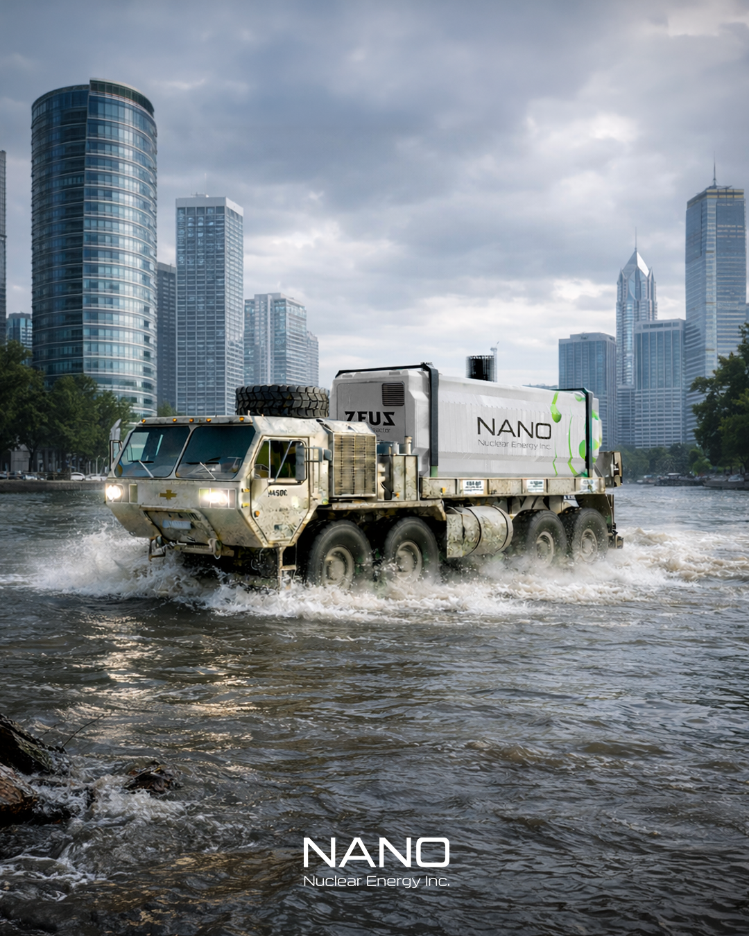
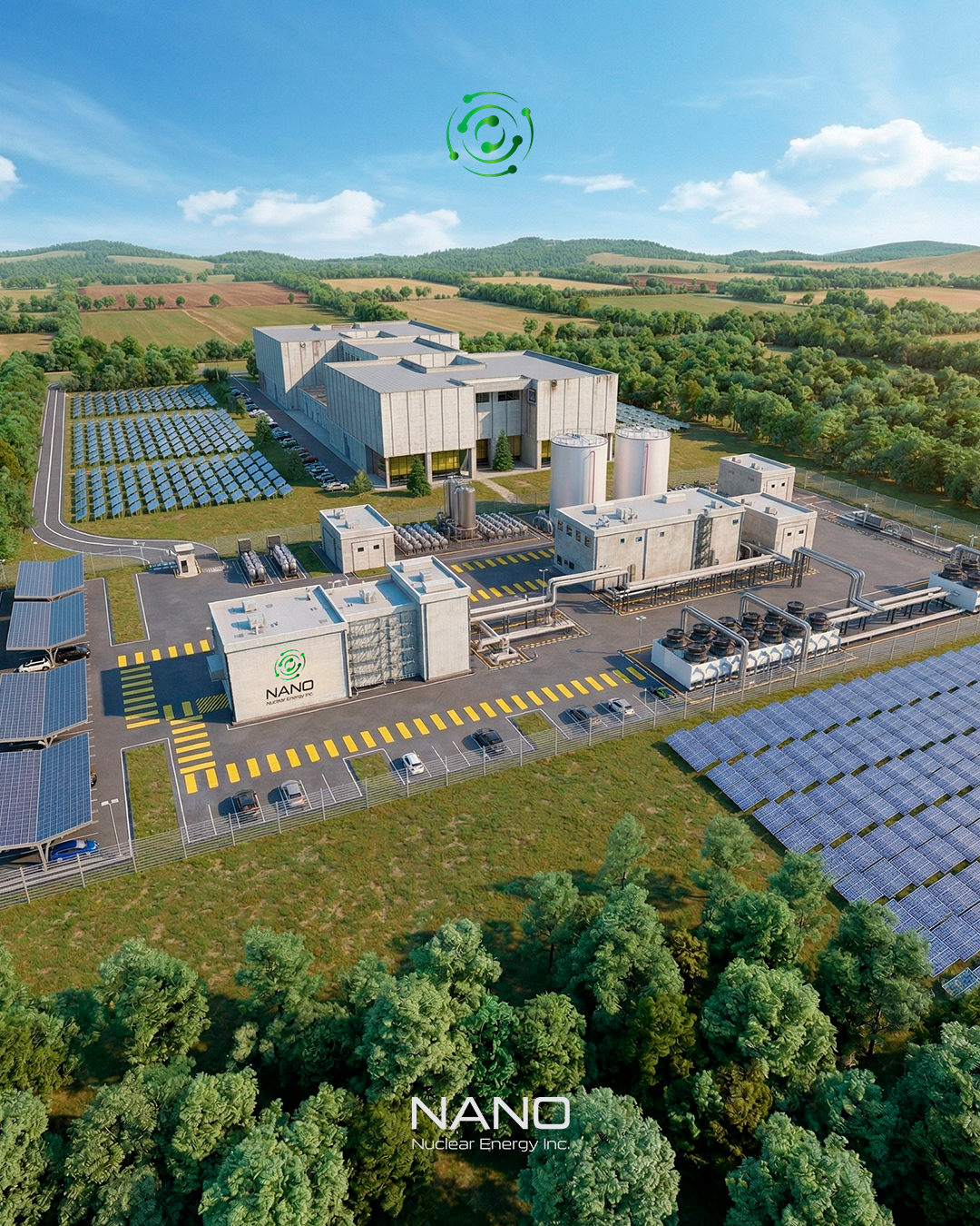
NANO Nuclear
Advanced technology translated into investor-facing clarity
NANO needed complex innovation to feel structured, serious and easier to understand. We turned dense technical communication into a sharper corporate visual system
DeliverablesCorporate visual system · Presentation design · Technical graphics · Social media structure
Strategic FocusMaking complex technology feel credible at first glance
- Turning complex technology into visuals people can understand, trust and remember
- Use realistic renders to make reactor applications feel tangible and easier to imagine
- Build a more institutional digital presence
- Simplify technical ideas without weakening the message
Final social systemAn investor-facing social presence with clearer structure
1 / 1
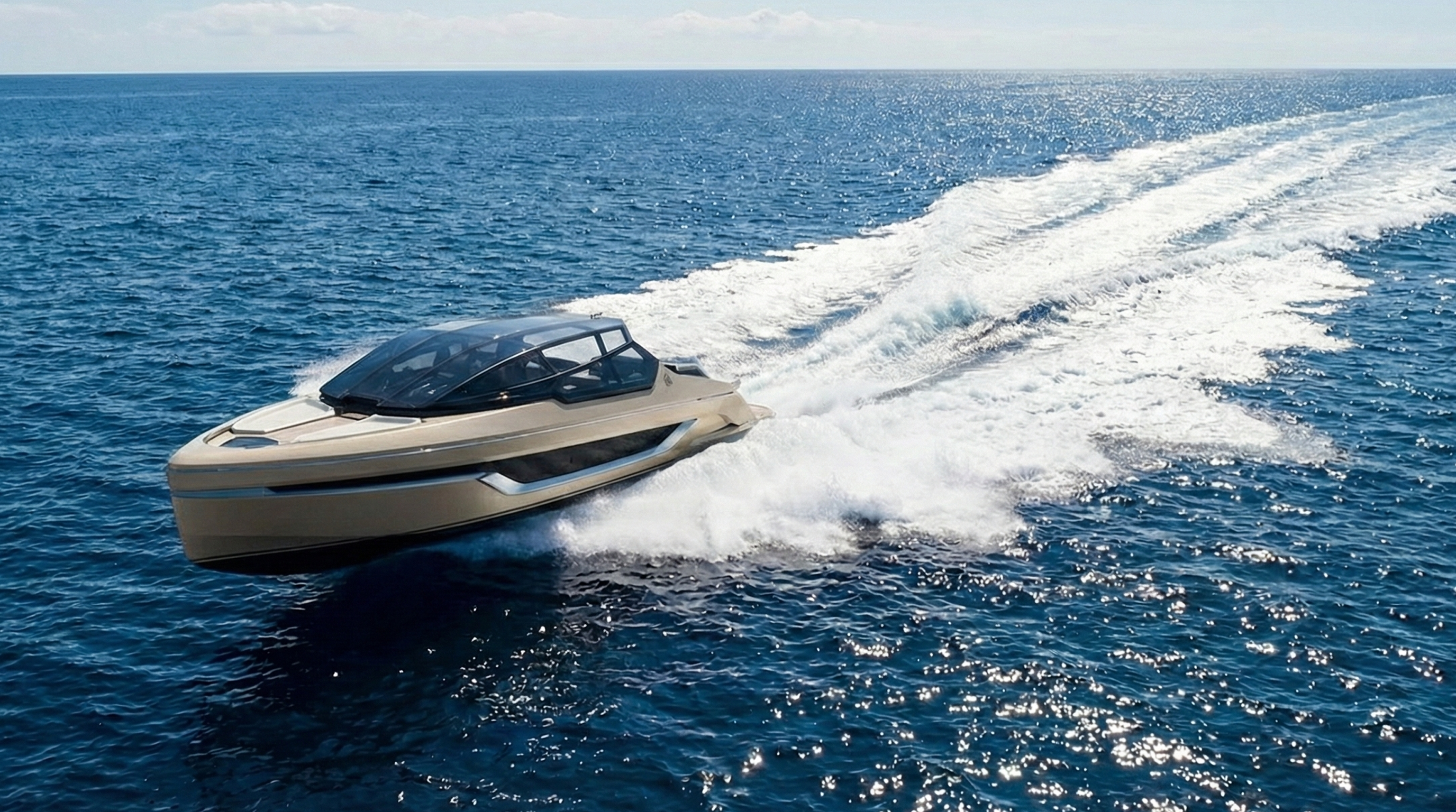
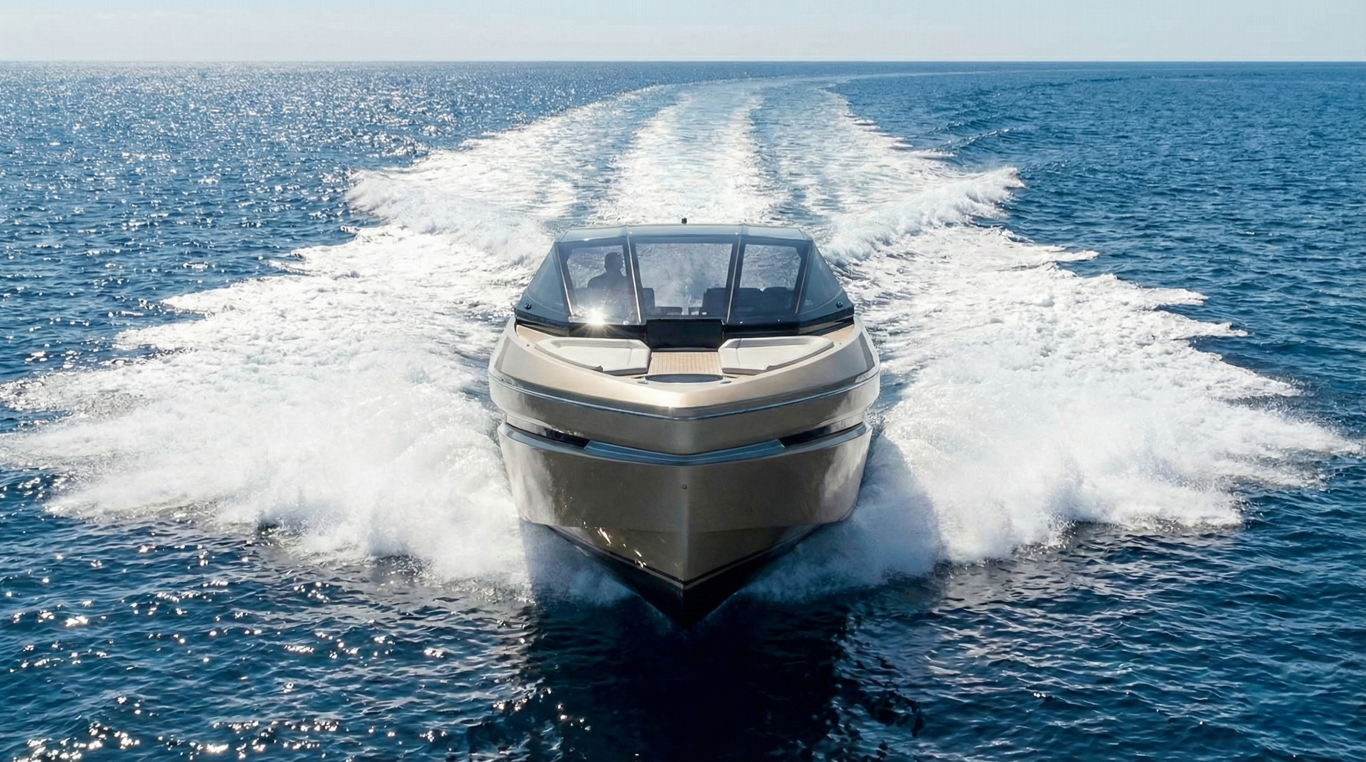
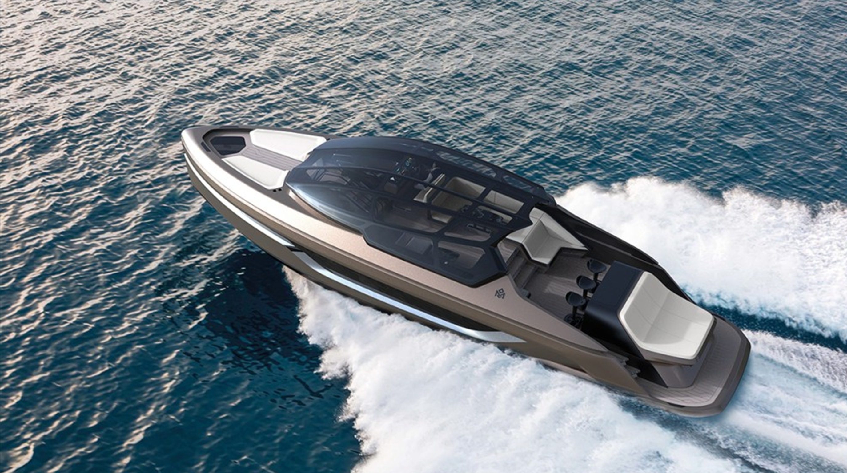
Case Study 03
Mirarri
A luxury world built through restraint, motion and atmosphere
Mirarri needed desire without noise. We built a visual world around cinematic movement, editorial restraint and a controlled social presence
DeliverablesLuxury visual direction · Editorial social grid · Lifestyle assets · Brand storytelling
Strategic FocusTurning product, lifestyle and digital presence into one luxury world
- Create desire through controlled atmosphere
- Use restraint to make the brand feel rarer
- Connect yacht, lifestyle and social presence
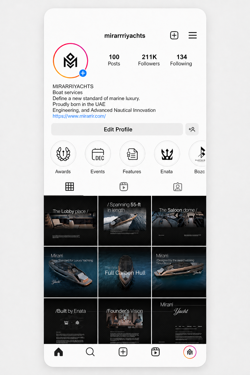
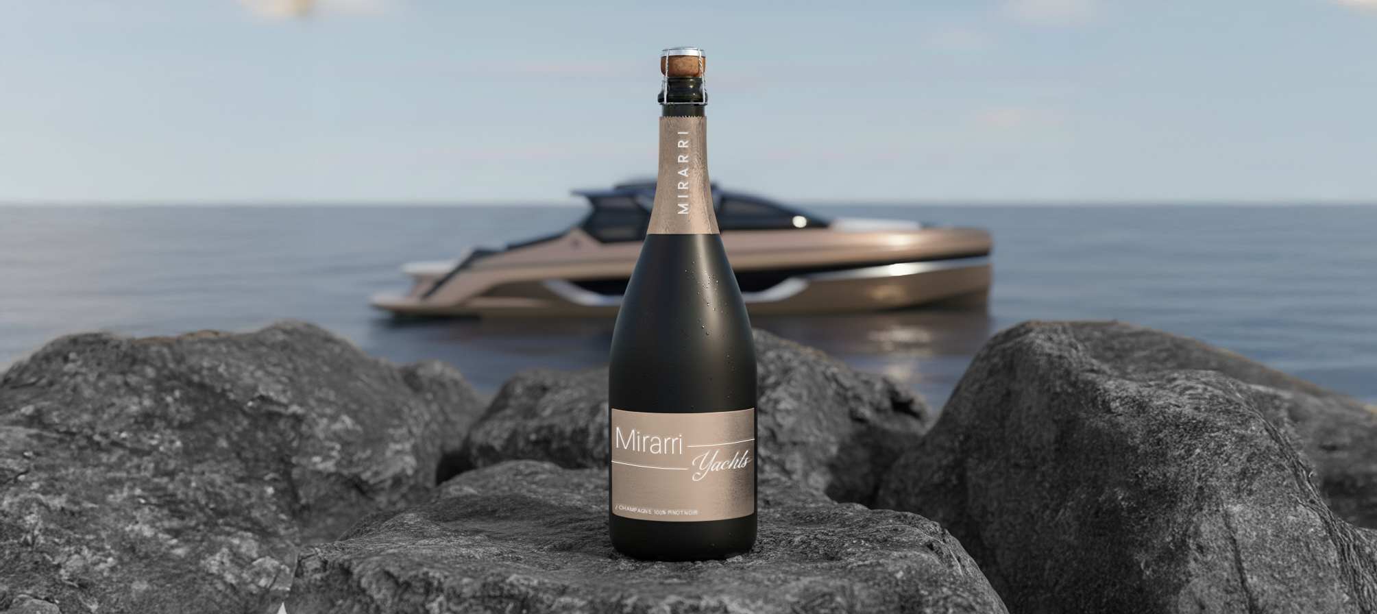
Editorial social gridA focused feed system for a controlled luxury presence
1 / 1
Process
System first. Assets second
We define the visual language before producing another asset. Then we apply it where the business is judged — social, web, decks, print, apparel and branded touchpoints
Audit
We find what weakens perception: inconsistency, noise, unclear hierarchy or low visual trust
Direction
We set the visual standard: tone, references, typography, color and hierarchy
Build
We design the assets that shape perception: social, web, decks, brochures, apparel and merch
Scale
We turn the direction into a system the brand can keep using
Services
Built for perception. Designed for permanence
Every asset should make the business feel clearer, stronger and more valuable
01
Brand Identity
Direction, typography, color, tone and visual standards
02
Website Design
Web presence with sharper hierarchy and stronger value
03
Social Media Systems
Profiles, feeds, posts and covers built as one system
04
Pitch Decks
Investor and sales decks with stronger visual authority
05
Brochures
Print and digital pieces that make the offer feel serious
06
Apparel
Brand clothing for teams, launches and high-touch moments
07
Merchandising
Physical brand touchpoints with a higher visual standard
08
Visual Systems
Reusable frameworks that keep the brand consistent
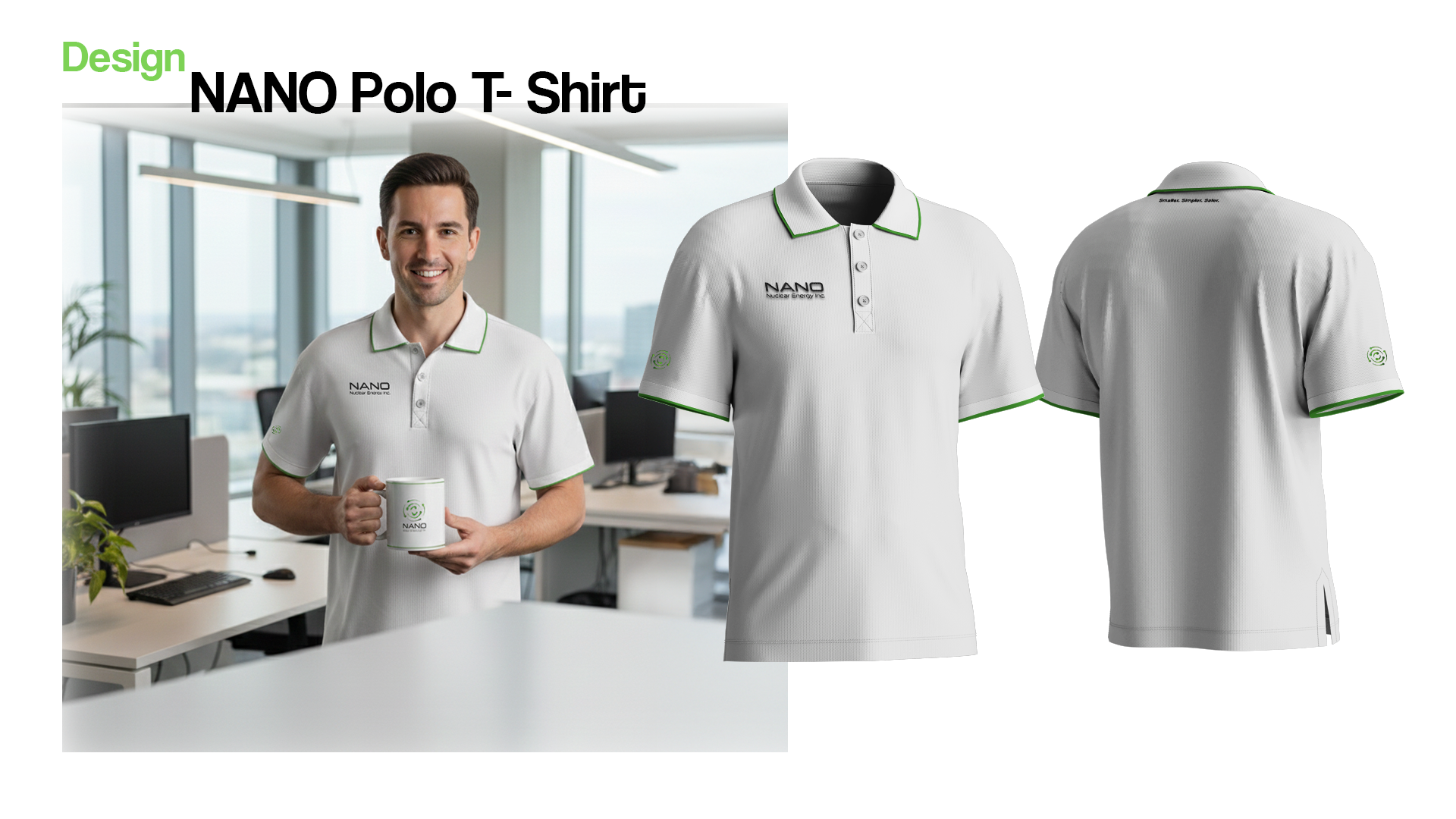
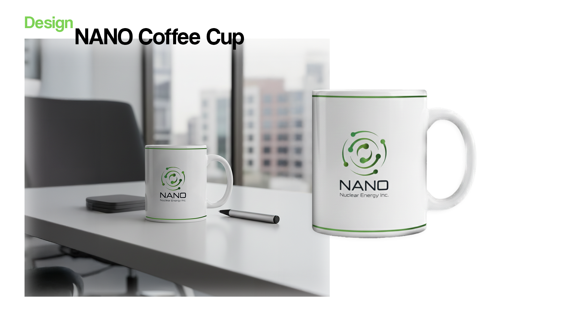 NANO Merch
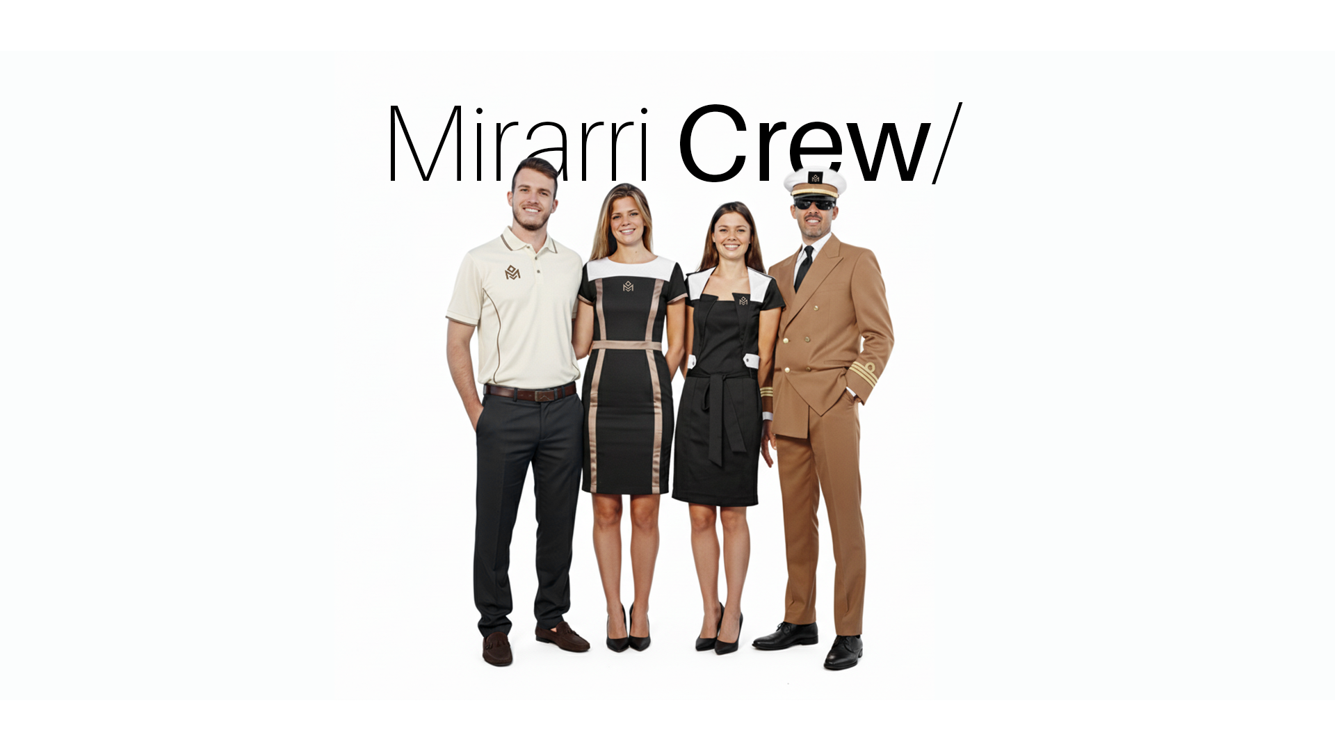 Mirarri Crew
Start Here
Show us what your brand looks like today. We’ll show you what it could become
Send us your website, profile, deck or current brand material. We’ll show what feels disconnected — and how to turn it into a system